Visual system, built for the browser
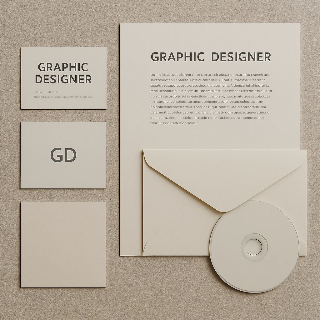
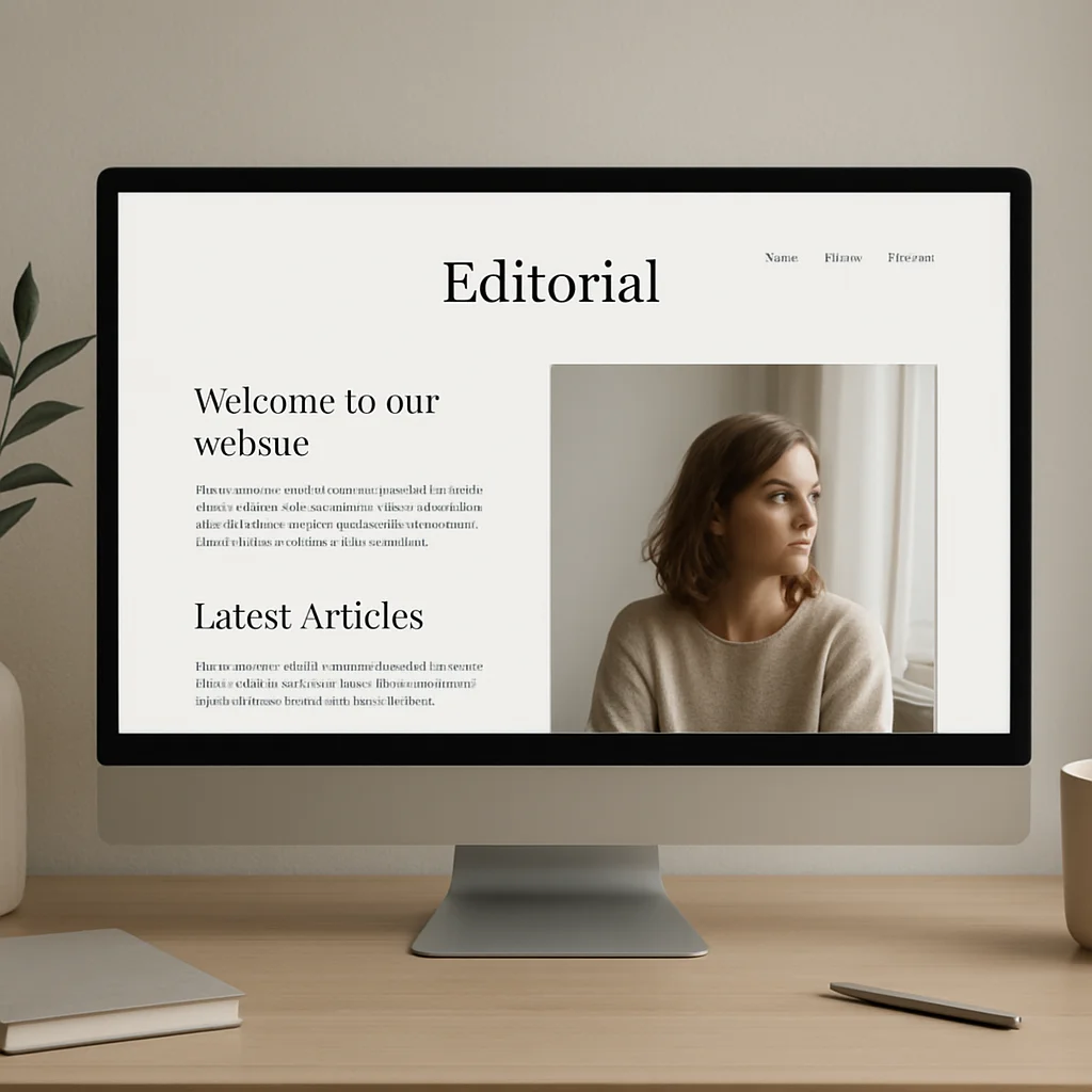
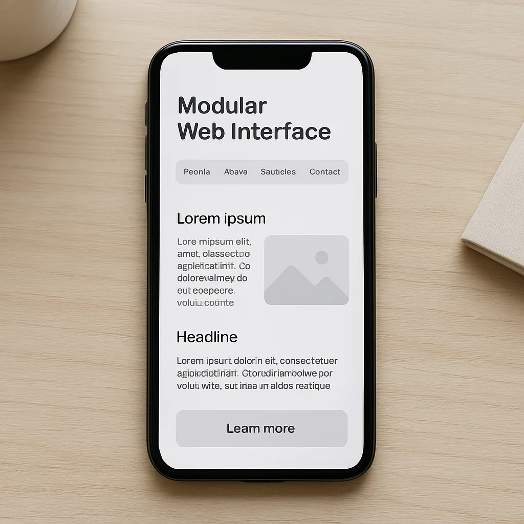
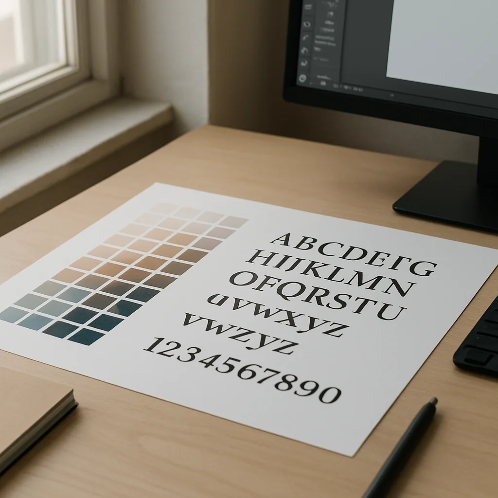
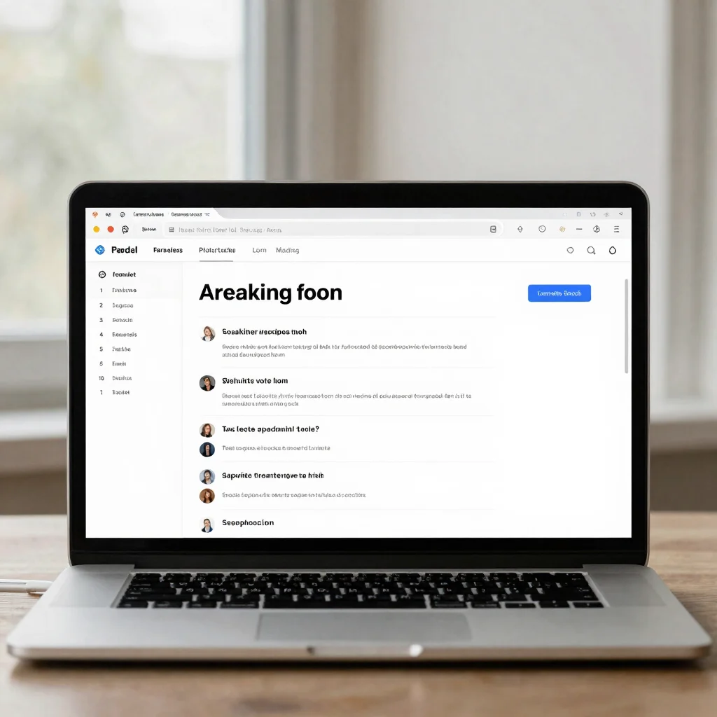
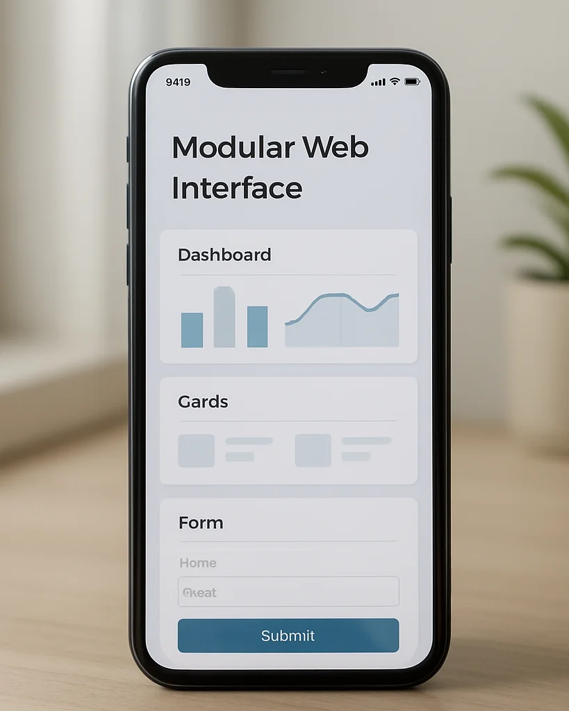
The identity was shaped first as a set of typographic and color decisions, then carried into a responsive interface. Each choice was tested at desktop and mobile sizes.
Implementation notes cover the component structure, the type scale, and the spacing system that keeps the layout consistent across breakpoints.